
Table of Contents
You can customize the appearance of the Describe It audio player to match your brand and style. Describe It offers two ready-made audio player styles, basic and advanced, with customizable labels, colors, borders, and more. You can even add your own custom CSS for complete control.
Switch between the basic and advanced audio player #
Describe It offers two ready-made default audio player styles, basic and advanced. The basic audio player includes a simple play button and title. The advanced audio player includes a play button, title, volume controls, and progress bar. If you have the basic audio player and would like to switch to advanced audio player, or vice versa, please follow the steps below.
- From the Shopify admin, navigate to Sales channels > Online Store > Themes.
- Click Customize next to the theme that has Describe It installed.
- Click the Sections icon in the left sidebar.
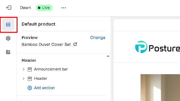
- In the Template menu at the top of the page, select the Products, then select the product template which has Describe It installed.
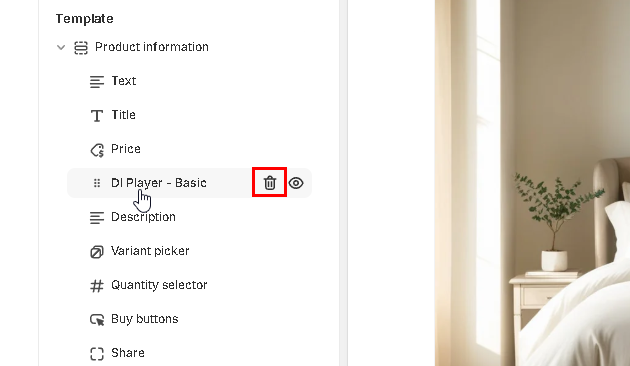
- In the left menu, click on the installed DI Player widget, then click on the trash can icon to remove it from your theme.
- Hover your cursor between menu items until the Add block pop-up appears.
- Click on the blue plus-sign, then click on Apps.
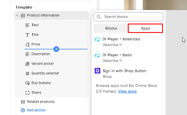
- Click on the Describe It audio player you want to add:
- DI Player – Basic: Includes a play button and title.
- DI Player – Advanced: Includes a play button, title, volume controls, and progress bar.
- Optional: Change where the audio player appears on the page by dragging and dropping the widget to an alternate place in the menu.
- Optional: Customize the audio player’s appearance by clicking on the DI player widget to open the style settings menu. For more information, please refer to the section below.
- Click Save in the top right corner.
Customize the audio player colors and style #
To customize the Describe It audio player style, please follow the steps below.
- From the Shopify admin, navigate to Sales channels > Online Store > Themes.
- Click Customize next to the theme that has Describe It installed.
- Click the Sections icon in the left sidebar.
- In the Template menu at the top of the page, select Products, then select the product template which has Describe It installed.
- In the left menu, click on the installed DI Player widget (DI Player – Basic or DI Player – Advanced) to access the style settings.
- Use the following instructions to customize the style settings:
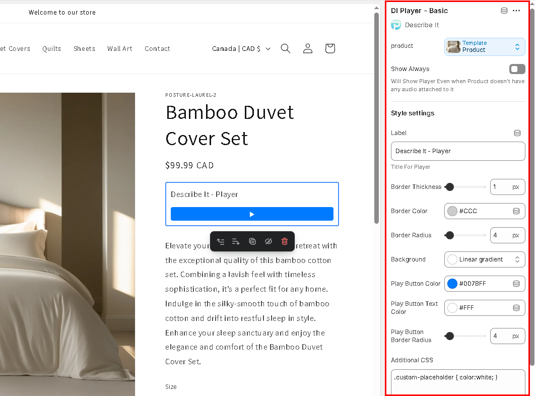
- Show Always: Move the toggle to the right to show the audio player on all products – even if they do not have audio available. To only display the audio player on products that have audio, keep the toggle off (left position).
- Label: Enter a label to display to your customers above the audio player.
- Border Thickness: Use the slider to select border thickness (enter 0 for no border).
- Border Color: Click in the field to select a border color or enter a HEX number.
- Border Radius: Use the slider to select the border radius (the higher the number, the more rounded the corners appear).
- Background: Click in the field to select a background color or enter a HEX number.
- Play Button Color: Click in the field to select a button color or enter a HEX number.
- Play Button Text: Click in the field to select a color or enter a HEX number.
- Play Button Border Radius: Use the slider to select the border radius.
- Progress Color (advanced widget only): Click in the field to select a color or enter a HEX number for the active progress bar color.
- Progress Placeholder Color (advanced widget only):Click in the field to select a color or enter a HEX number for the inactive progress bar color.
- Progress Height (advanced widget only): Use the slider to select the thickness for the progress bar.
- Additional CSS: Enter your own CSS for custom styling.
- Click Save in the top right corner.


